
Designing Hillaby: A Barbadian Brand Built to Scale in the US

Designing Hillaby wasn’t just another branding project. It was a moment that reminded me why I love working with founders who are building something real — something rooted in culture but ready to scale beyond borders. It started with a simple notification in my contact form: two Barbadian entrepreneurs reaching out, eager to work together. We scheduled a meeting immediately. Before we met, they sent over a file outlining their early ideas — colours, textures, illustrations, and the future they envisioned for the brand. I’m used to clients coming with their own visual assumptions, but like most founders who work with me, they trusted my expertise and were open to a deeper, more strategic direction.
When we finally sat down, the conversation shifted from aesthetics to identity. Hillaby wasn’t just a name; it was a statement. It referenced Mount Hillaby, the highest point in Barbados — a symbol of elevation, strength, and cultural pride. The founders were clear: the brand shouldn’t feel touristy or like a postcard begging visitors to come to the island. It needed to feel Barbadian in a way only Barbadians would understand, while still being refined enough to expand confidently into the US and other markets.
After negotiations and expectations were aligned, we signed the contract and began the structured process I use with every founder: the initial brand deep‑dive, the stylescape presentation, the brand identity reveal, and finally, delivery once the last deposit is paid. In that first meeting, I learned what Hillaby truly represented — principles, heritage, elevation, and a quiet confidence rooted in Barbadian culture. We built audience personas that shaped the stylescapes, ensuring every visual direction was grounded in who the brand was speaking to.
A week later, I presented the stylescapes. They chose the one that aligned perfectly with the brand’s direction — and coincidentally, my personal favourite. Then came the hardest part: the logo. I spent weeks exploring calligraphy, abstract forms, animal illustrations — hundreds of sketches, both digital and on paper. I even swore I wouldn’t use the trident, because it’s a cliché in Barbadian branding. But when I was clearing out the “bad ideas,” something clicked. The trident’s silhouette echoed the crown concept I had been exploring. After resisting it for days, I merged the two — and that’s when the idea finally landed.A week later, I presented the stylescapes. They chose the one that aligned perfectly with the brand’s direction — and coincidentally, my personal favourite. Then came the hardest part: the logo. I spent weeks exploring calligraphy, abstract forms, animal illustrations — hundreds of sketches, both digital and on paper. I even swore I wouldn’t use the trident, because it’s a cliché in Barbadian branding. But when I was clearing out the “bad ideas,” something clicked. The trident’s silhouette echoed the crown concept I had been exploring. After resisting it for days, I merged the two — and that’s when the idea finally landed.

Stylescape 1

Stylescape 2

Stylescape 3

Stylescape 4- Chosen stylescape
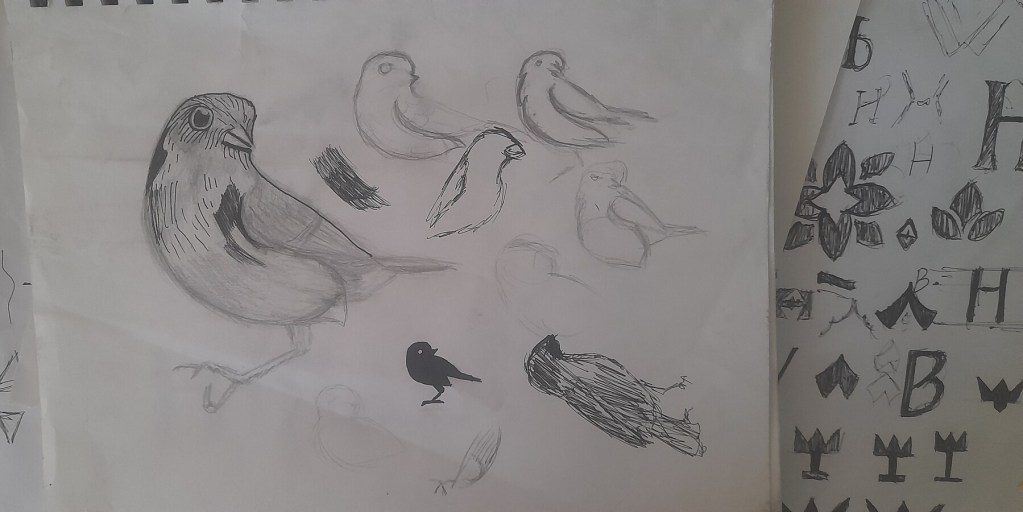


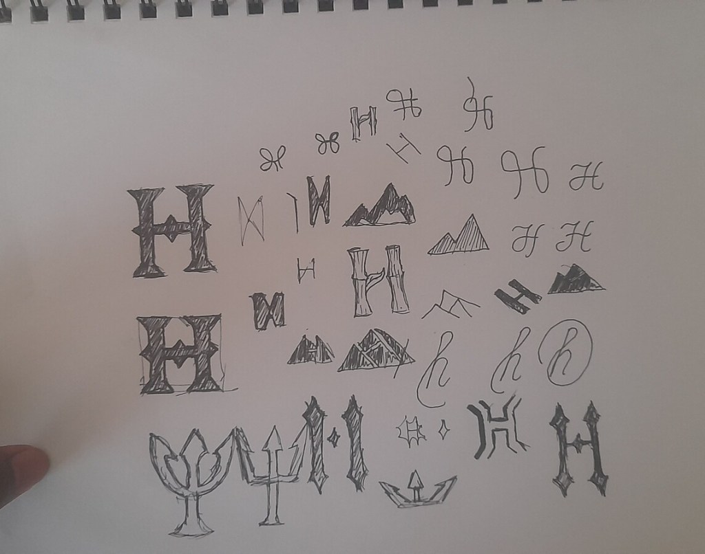


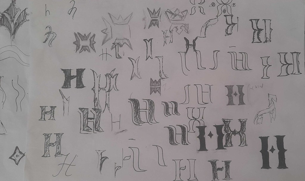


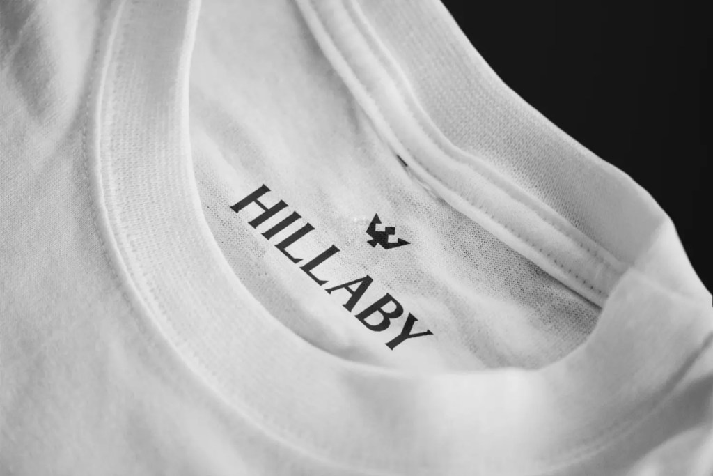
The final logo blends the Barbados trident with a crown, grounding the brand in Barbadian heritage while signalling elevation, prestige, and ambition. We explored an alternative direction using the Barbados bullfinch, but ultimately chose the crown‑trident mark because bird logos are overused globally. Both concepts were paired with custom typography, but the all‑caps type created for the crown‑trident identity felt more elevated and aligned with the brand’s principles.

Then came the colour palette — rooted in elements Barbados is known for locally and internationally: sun, sea, sky, mango, dragonfruit, coconut, vegetation. I created Pantone and CMYK versions to ensure consistency across digital and print. When I presented the full brand identity, the founders were genuinely excited and grateful. In our final meeting, we walked through the filing system and brand style guide.


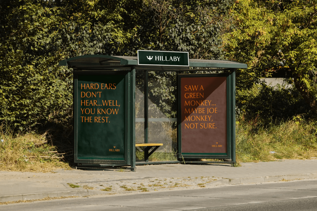



When I posted the project on Instagram, the response was overwhelming — one person even said it looked like something on the level of Gucci or Rolex. And honestly, that’s the standard I aim for with every founder who trusts me with their brand.
Hillaby was another job well done — and another reminder of how powerful Caribbean‑rooted, globally‑ready branding can be when it’s done with intention.
