Designing Yard Fowl: How I Built a Rebellious, Culture‑Driven Restaurant Brand

Branding Yard Fowl was one of those projects that reminded me why I love designing for culturally rooted businesses. Yard Fowl is an up‑and‑coming rum bar kitchen in St. George, Barbados — but the brand’s spirit reaches far beyond the island. It’s rebellious, community‑driven, and proudly rooted in Barbadian identity. My job was to translate that energy into a visual identity that feels authentic locally, yet compelling enough to stand strong as the brand expands internationally.
On the island, “yard fowl” is a term with bite. It refers to the wild chickens that roam freely — unowned, unbothered, and unapologetically themselves. Calling someone a yard fowl means they’re rebellious, free‑spirited, and unwilling to be tamed. That’s exactly the energy the owner wanted to capture: a brand that feels like an outlaw, but one that invites people into a sense of belonging.
We started with five stylescapes. Each explored a different angle of rebellion, community, and cultural identity. The client chose the one I called Modern Herald — a direction inspired by old emblems and crests used by clans and knights to signify allegiance. It was the perfect visual metaphor: a symbol of belonging, loyalty, and shared identity. That’s what Yard Fowl is meant to be for its patrons.

Chosen stylescape
The bird itself went through a long evolution. I began with detailed illustrations and expressive sketches, trying to capture the wild, rebellious nature of the animal. But as the brand’s future needs became clearer, I shifted toward a more minimalist, abstract form — something functional, scalable, and timeless. I lost many of the digital sketches along the way, but I still have some of the pen‑and‑pencil explorations that show how the idea took shape.

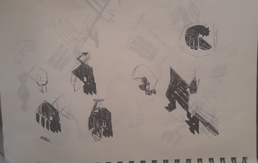


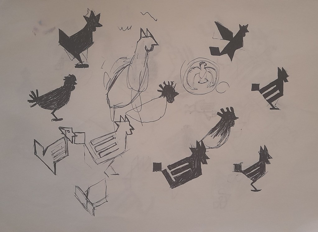
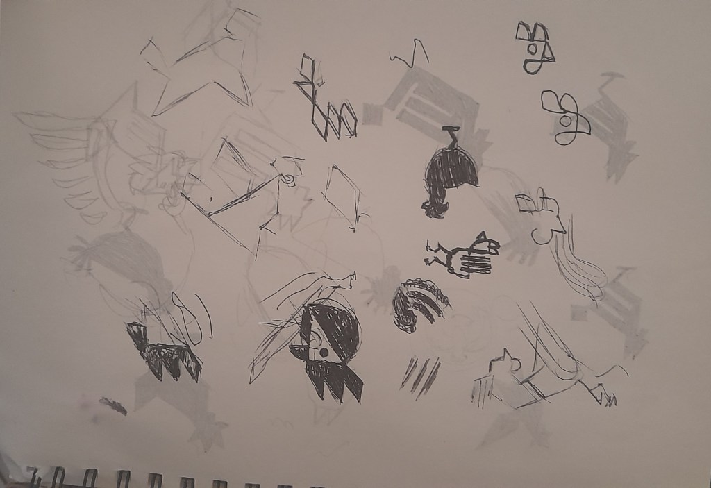

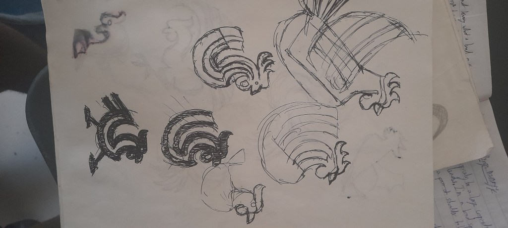
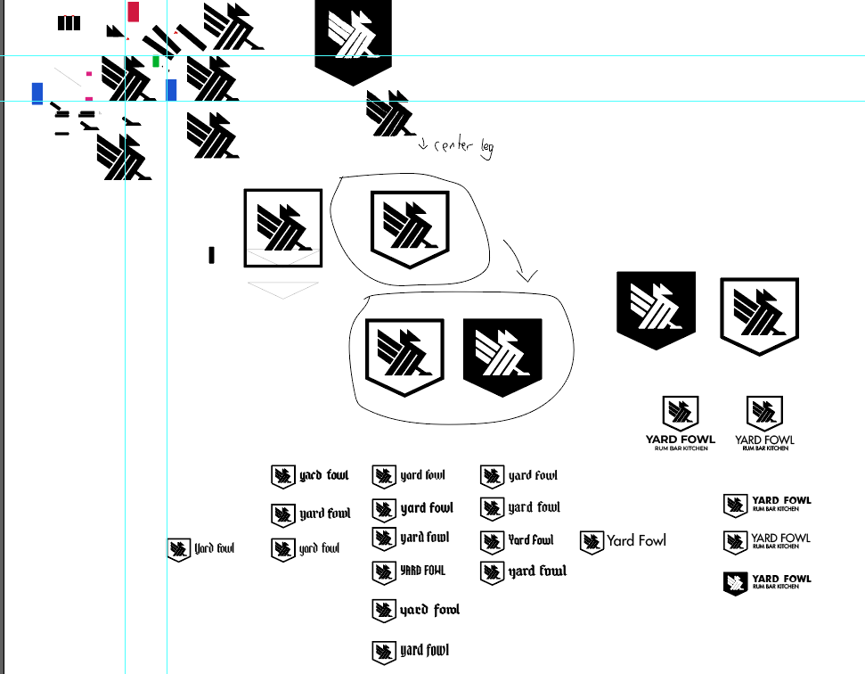
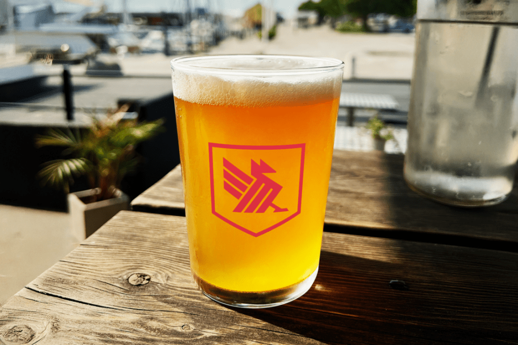
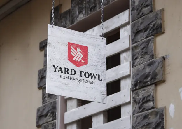
The final mark is simple, symbolic, and rooted in meaning. It carries the spirit of rebellion without relying on clichés. It feels like a crest — a badge of belonging — but modern enough to live across signage, merchandise, menus, and digital platforms.

When I presented the brand, the client told me it felt like I “crawled into her brand and put it on the screen.” That’s the highest compliment I can get as a designer. Yard Fowl wasn’t just a logo project — it was a cultural translation, a story of identity, and a visual system built to grow with the brand as it expands beyond Barbados.
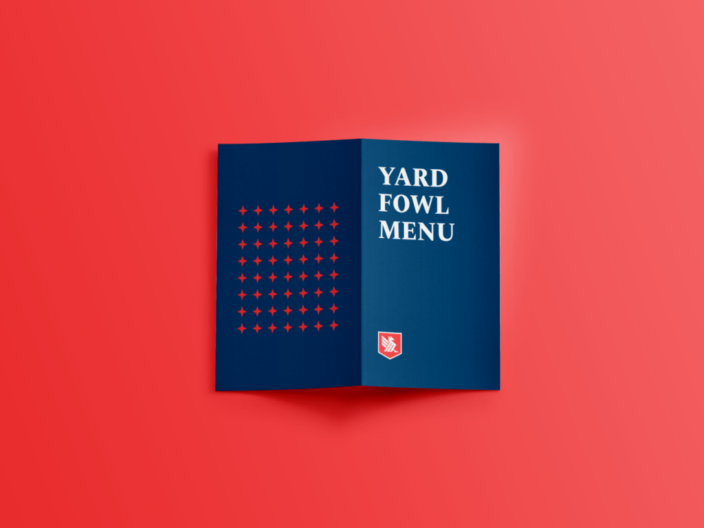
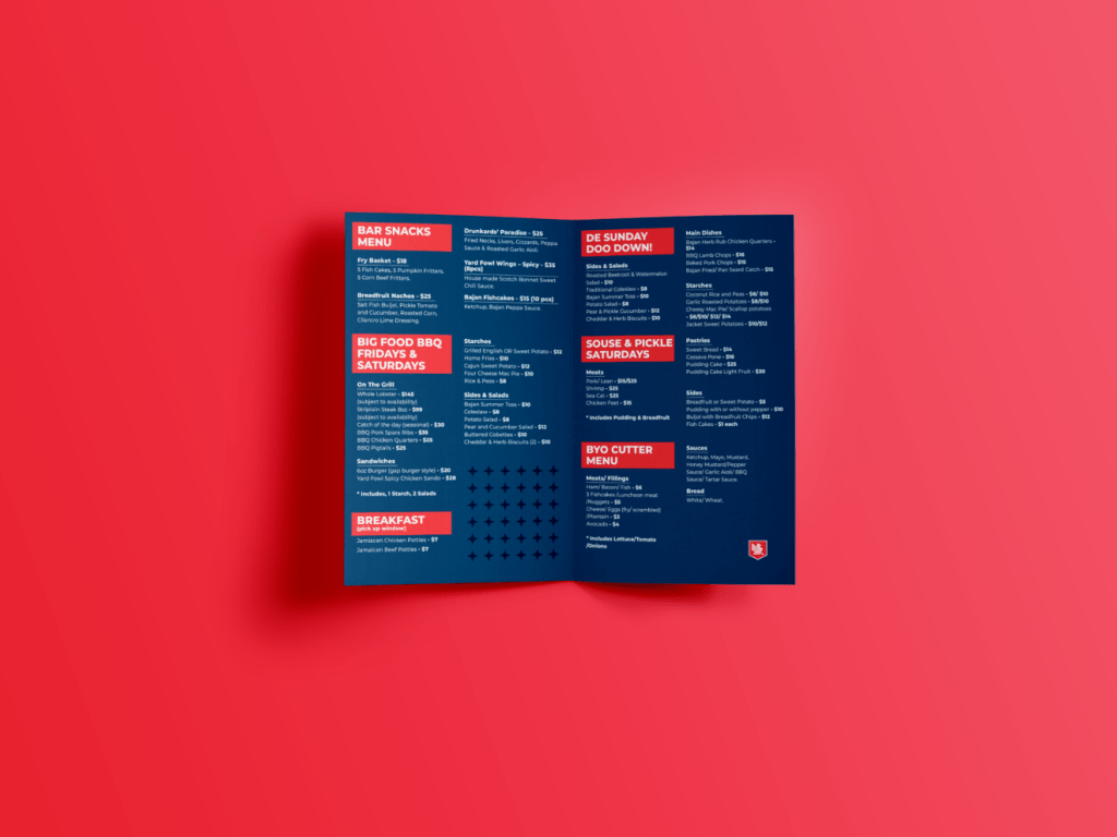
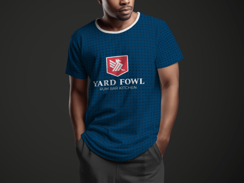



If you’re looking to build a restaurant brand in the usa, then Contact Us