
Experiential Branding in Fintech: What Mastercard Gets Right (and What Founders Can Learn)

I spend a lot of time studying branding projects from other studios and designers. It’s part admiration, part education, and honestly part curiosity, because in this industry there’s always more to learn. Recently, I revisited the Mastercard rebrand done by Pentagram in 2016, and as someone who lives and breathes fintech and finance branding, I found myself going down a much deeper rabbit hole than I expected.
Mastercard is one of the most iconic financial brands in the world, but what fascinates me most is not just the logo or the visual identity. It’s the experience they’ve built around it. And if you’re a fintech founder, there’s a lot here worth paying attention to.
Mastercard’s story goes back to the late 1940s, when banks issued special paper that functioned like cash in select stores. By 1960, the “International Card Association” was formed, which eventually evolved into Mastercard International. At its core, Mastercard is a facilitator of financial transactions. It authorizes, secures, and connects merchants, banks, and consumers. If you’re not using a Mastercard debit or credit card, you probably have a Visa equivalent. These brands are woven into everyday life, and their presence is so familiar that we barely think about it.
What we do notice, though, is the logo. Two overlapping circles, one red and one yellow, merging into orange. A symbol so simple and so universal that you can recognize it anywhere. It first appeared in 1966 and has been refined over the years, but the concept has remained the same.

The logo history of Mastercard, courtesy of https://logohistory.net
When Pentagram took on the Mastercard rebrand, the brief was ambitious: build on the brand’s heritage while positioning it alongside the world’s leading technology companies. Andrea Trabucco‑Campos and the Pentagram team approached it with a clear intention to simplify, unify, and modernize. The circles stayed, but instead of clashing, they now blend seamlessly, creating a smoother, more intentional overlap. The wordmark was redrawn in a clean, modern lowercase sans serif. The proportions shifted to give the icon more prominence. The visual system expanded into a full language of circles, scales, and motion. Even the photography guidelines became more intentional and more tightly controlled.

Image courtesy of https://www.pentagram.com
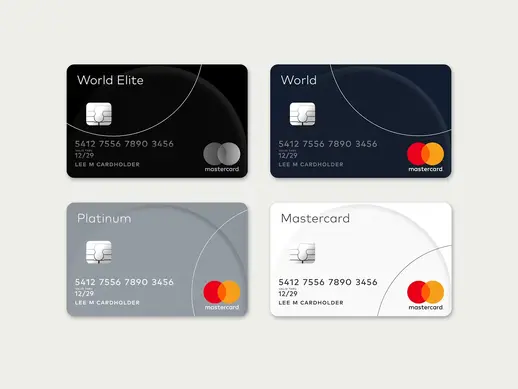
Image courtesy of https://www.pentagram.com
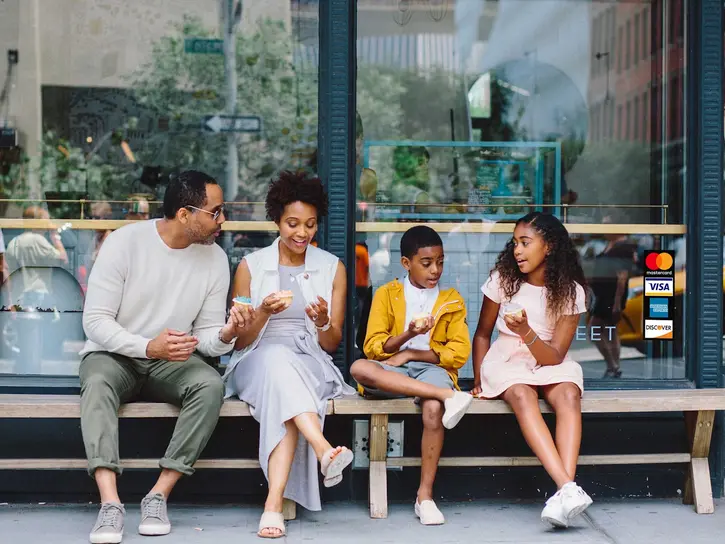
Image courtesy of https://www.pentagram.com

Image courtesy of https://www.pentagram.com

Image courtesy of https://www.pentagram.com

Image courtesy of https://www.pentagram.com
Then came the boldest move. In 2019, Mastercard officially dropped the wordmark from the logo and began using the icon alone. This placed them in the same category as Nike and Apple, brands so universally recognized that the symbol alone carries the entire identity. They didn’t make this decision lightly. Research showed that more than eighty percent of people could identify Mastercard by the icon alone. That level of recognition is the result of decades of consistency, clarity, and brand equity.

But the part that interests me most is what happens beyond the visuals. In a previous blog, I talked about branding as an experience — how a brand lives in the moments people have with it, not just in the logo or the typography. Branding as Identity: Beyond the Logo Mastercard is one of the strongest examples of this, especially in fintech. People assume financial brands are all about money, but Mastercard’s brand has always been about people. Their legendary 1997 “Priceless” campaign reframed the entire brand around human connection. The message wasn’t about transactions. It was about the moments those transactions made possible. A father and son at a baseball game. The cost of the items leading up to the moment. And then the emotional payoff that money can’t buy. That idea still drives Mastercard today.
In 2020, they expanded this into Mastercard Priceless, a full experiential ecosystem that gives cardholders access to curated events, exclusive restaurants, VIP travel perks, hotel upgrades, and more. It’s not about the card. It’s about the life you get to live because of it. That’s experiential branding at its finest.
Mastercard also excels in sensory branding, which is something most fintech brands overlook entirely. They introduced a six‑note melody that plays when a transaction is approved. It’s subtle, but it matters, because one in five shoppers abandon purchases due to payment insecurity. That tiny sound increases trust, confidence, and emotional reassurance. They also created the Touch Card, a tactile system designed for the visually impaired. Credit cards have a square notch, debit cards have a round notch, and prepaid cards have a triangular notch. It’s simple, thoughtful, and inclusive — a perfect example of brand experience through accessibility.
Studying Mastercard made me realize how much depth there is to truly experiential branding. It’s humbling, inspiring, and a reminder that great brands are built with intention at every touchpoint. Even as someone who specializes in fintech branding, I found myself both impressed and a little insecure, because the level of detail they operate at is extraordinary. But in my defense, I’m one person, and they’re a multibillion‑dollar company with global teams. Still, the principles behind their brand are universal and absolutely relevant to fintech startups. Branding is not just visual. Trust is the currency of fintech. Clarity always wins. Consistency builds recognition. Accessibility is not optional.
Mastercard is one of the strongest examples of experiential branding in fintech. From visual identity to sensory cues to human‑centered storytelling, they’ve built a brand that people don’t just recognize — they feel. And that’s the goal for any fintech brand that wants to stand out.
If you’re building a fintech or financial brand and want an identity that goes beyond visuals — one that builds trust, clarity, and emotional connection — that’s exactly the work I do. Let’s build something unforgettable. Contact Us
