Flow’s Evolving Visual Identity: A Designer’s Breakdown

Flow, the telecommunications giant found in Barbados and across the Caribbean, has been slowly refining its visual identity — and today, we’re breaking down what’s working, what’s improved, and what still raises an eyebrow.
The new logo isn’t a drastic departure from the old one. Flow’s previous wordmark leaned heavily into the idea of fluid movement: connected letterforms, overlapping shapes, and those soft drop shadows meant to mimic depth. In theory, it communicated motion. In practice? Effects like drop shadows tend to fall apart outside of digital environments.
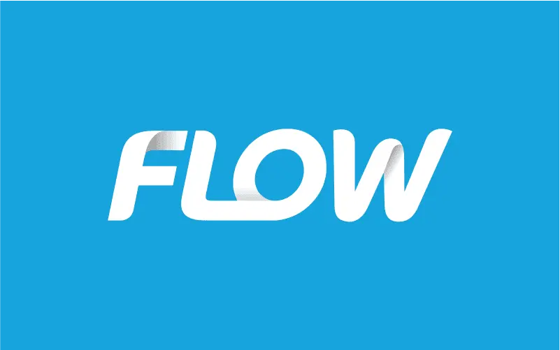
Old Flow logo
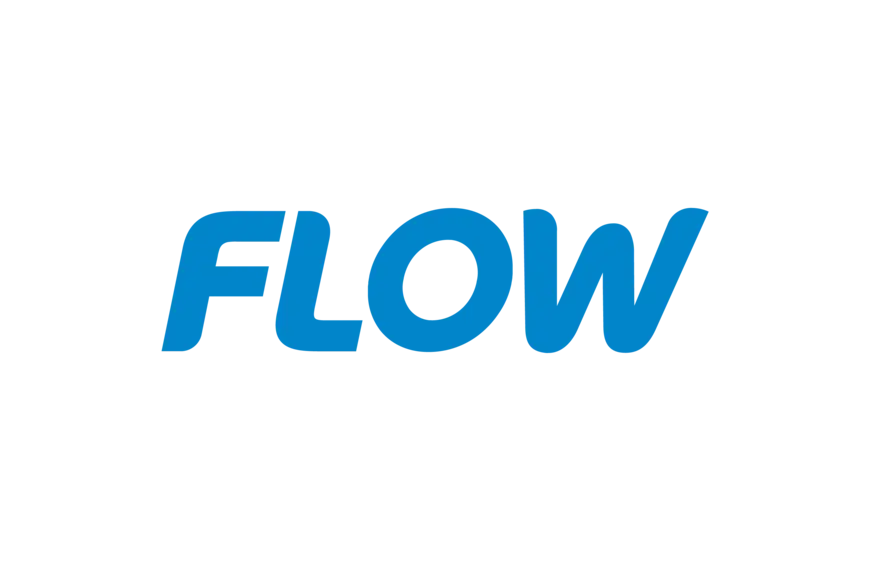
New Flow logo
I remember seeing the old Flow logo printed on one of their table covers — that shadow effect, which looked clean on-screen, turned into what can only be described as muddy smudging in print. This is exactly why effects on logos are generally a no-go. A logo needs to survive every medium: digital, print, embroidery, signage, you name it.
The updated logo keeps the leaning oblique angle, which still gives it that sense of motion — appropriate for a name like “Flow.” It’s cleaner, simpler, and more adaptable, which is exactly what a modern telecommunications brand needs.
What’s even more interesting is the evolution of their brand collateral. Flow moved away from the blob-like illustrations they used for years and shifted toward imagery rooted in Caribbean life — scenes, culture, environment, and people. It’s a refreshing pivot. If I’m being honest, the illustrations could be a little simpler and less detailed, but they still work well. No real complaints there.

Old Flow advertisement

Old Flow advertisement

Old Flow advertisement

New Flow advertisement

New Flow advertisment

New Flow brand collateral
The layout across their collateral is structured and intentional. Information is easy to navigate, digest, and understand. Even when paired with highly detailed, vibrant illustrations, the hierarchy holds everything together. The illustrations themselves are extremely colourful, which creates a strong contrast against Flow’s sterile, corporate blue. Colour theory in action: cool blues balanced by warm oranges and other saturated hues. It’s executed beautifully.
What stands out most is the consistency. Both the layout and especially the illustration style show that Flow is taking brand management seriously. Many companies fall into the trap of using random stock illustrations or letting in-house designers whip up something disconnected from the brand language. Flow, however, maintains a unified visual system — and honestly, it’s impressive.
It’s also fascinating to see how Flow’s visual language has evolved over the years, especially when compared to its red competitor, Digicel. The contrast between the two brands — visually and tonally — is stark, intentional, and effective.
Flow’s identity today feels more mature, more Caribbean-rooted, and more cohesive than ever.
If you’re interested in building a brand that stands the test of time Contact Us