How I Designed a Cookie Brand: The Story Behind Cookie Overload

Last year, I was commissioned to design a cookie brand called Cookie Overload — a project that carried more weight than most. The client had actually met me three years earlier and waited, saved, and planned specifically to work with me. By September 2026, we finally began.
From the start, I knew this brand would be meaningful. But I also sensed something else: Cookie Overload might be nearing the end of its lifecycle. During our first discovery meeting, she mentioned she might rebrand or even start a new pastry business the following year. That told me this identity needed to honor the brand’s six‑year journey while still feeling fresh, intentional, and true to what it had become.
Understanding the Brand’s Personality
We began with deep discovery sessions — the brand’s history, personality, attributes, audience, beliefs, values. One thing stood out: Cookie Overload wasn’t just a bakery. It was a story of risk, courage, and mastery.
She described the brand as:
- Consistent — committed to the highest level of cookie‑making mastery
- Slightly feminine — but not girly, since men also buy from the brand
- Inspirational — she quit her job to pursue pastry entrepreneurship and wants others to feel empowered by that
- Romantic — men often buy her cookies as gifts
- Fun — because at the end of the day, it’s a cookie brand
We built audience profiles around these traits, shaping a clear emotional and visual direction.
Choosing the Visual Direction
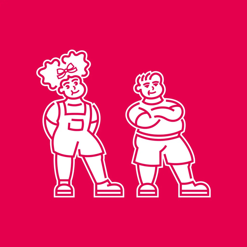
The following week, I presented three stylescapes — each exploring a different possible identity. Three of them leaned heavily into character illustrations and bold typography. The one she chose blended a soft romantic undertone with playful character illustrations. It struck the balance she wanted: fun, emotional, and expressive.
With the direction approved, I moved into design.
Designing the Logo
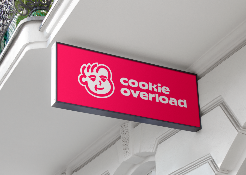
I started with typography. I knew the logo needed to feel bold, chunky, and slightly stretched, almost like malleable cookie dough. I built the letterforms wide rather than tall, beginning with the “O” to establish the visual rhythm. The “E” and “K” were trickier, but after several iterations, I found the right structure — playful, modern, and unmistakably “cookie.”

Creating the Character Illustration
Initially, I designed two characters — a boy and a girl. After client feedback, I refined it to focus solely on the boy. I added a few cookie illustrations as supporting brand assets but kept them limited to maintain clarity and modernity.
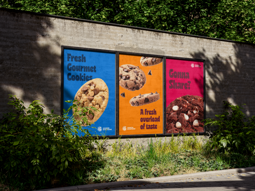
Because the brand prides itself on quality, consistency, and mastery, I incorporated real cookie photography into the collateral. It grounded the brand in authenticity and craftsmanship.

Building the Visual Language
The brand typography is chunky, bold, and playful. When combined with the character illustration, cookie photography, and minimal supporting assets, the identity becomes exactly what it should be: Cookie Overload.
I wanted the brand to feel modern while still delivering what people expect from a cookie brand — warmth, indulgence, and fun. So I blended minimalism with excess. The name itself demands abundance, but abundance doesn’t have to be chaotic. Cookies appear everywhere, but the design stays clean, intentional, and easy to understand.
That balance — fun without clutter, indulgent without childishness — is what brought Cookie Overload to life.