
Inside National Geographic’s Rebrand: A Modern Identity Built on Exploration, Storytelling, and Technology

National Geographic has always been more than a media brand — it’s been a doorway. For over a century, it has taken us across continents, beneath oceans, through cultures, and into the most remote corners of the planet. Since 1890, the National Geographic Society has supported educators, scientists, conservationists, technologists, and storytellers who push our understanding of the world forward. Their work spans ocean and land conservation, wildlife protection, human history, culture, planetary health, and even space exploration.
For decades, the brand’s most recognizable symbol was the iconic yellow border framing its magazine covers. In 1997, Chermayeff & Geismar transformed that border into a full visual identity system — a simple, powerful mark that acted as a window into the world. Paired with a bespoke wordmark, the identity unified National Geographic’s expanding ecosystem: the magazine, the television channel, publishing divisions, educational ventures, and more. It was one of the earliest examples of a brand building a cohesive system across multiple platforms long before “brand architecture” became a buzzword.

Image courtesy of Chermayeff & Geismar & Haviv

Image courtesy of Chermayeff & Geismar & Haviv
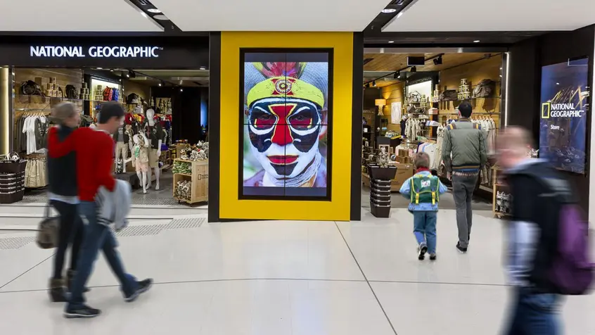
Image courtesy of Chermayeff & Geismar & Haviv
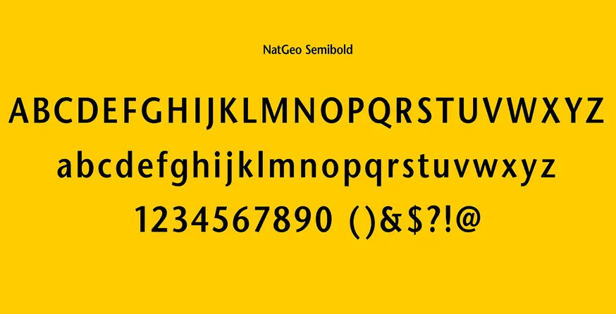
Image courtesy of Chermayeff & Geismar & Haviv
A New Era After the 21st Century Fox Merger
In 2016, following a major structural shift and a joint venture with 21st Century Fox, National Geographic entered a new chapter. The organization split into two entities — the non-profit Society and National Geographic Partners — with the commercial arm returning a portion of its earnings to support the Society’s mission. With this shift came the need for a refreshed identity. As the CEO put it at the time, it wasn’t so much a rebrand as “new brand work.”
The goal was ambitious: unify the nonprofit and commercial sides under one elevated, modern, premium brand. Confident in their global recognition, they even dropped the word “Channel” from the logo, trusting the yellow border to carry the weight.
To bring this vision to life, National Geographic hired New York–based branding studio Gretel to redesign the entire visual ecosystem — from the magazine to on‑air graphics to digital experiences. The brief was clear: reflect the sophistication, modernity, and authority of a brand that leads in science, adventure, and exploration.
“Further”: A Brand Built on Exploration
Gretel’s work centered on a new guiding idea: Further. More than a tagline, it became a philosophy — a reminder of how National Geographic continually pushes boundaries and expands our understanding of the world.
In their own words, Gretel described the brand’s essence:
“From its inception in 1888, National Geographic has been about exploring the unknown, constantly pushing the boundaries of our understanding.”
Photography remained the heart of the brand. It always had been — even when photography itself was considered experimental. Today, that legacy continues across platforms, including their massive Instagram presence, one of the largest non‑celebrity accounts in the world. The yellow border still acts as a window, but now the brand’s digital reach extends that window to millions daily.

Image courtesy of Gretel
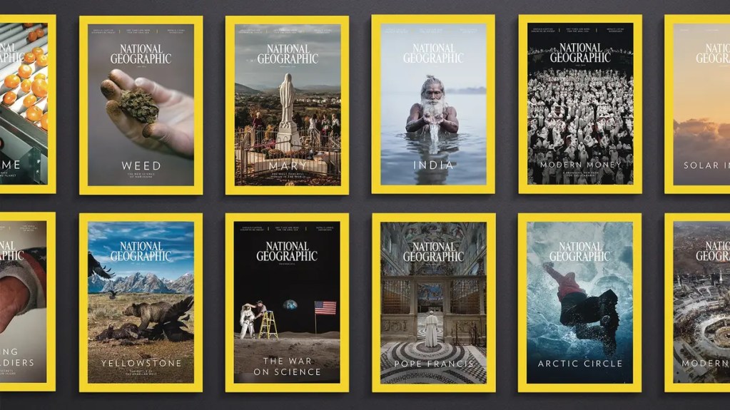
Image courtesy of Gretel
A Visual Overhaul Rooted in Clarity
The redesign began with the magazine. Over time, the covers had become cluttered with typography and overly staged imagery. Gretel stripped everything back, letting photography reclaim center stage. What started as a visual refresh quickly evolved into a full rebrand across every touchpoint.
Two new visual devices emerged from the world of scientific exploration:
1. Mapping — a system inspired by how data points come together to form a complete picture. In motion, images tile softly into place, revealing themselves like discoveries.
2. The Index — a visual continuum inspired by measurement and progress. As Gretel described it:
“We only move forward along the X‑axis and we never stop, we only slow down.”
These devices appear subtly across print, digital, and motion, reinforcing the idea of constant exploration and forward movement.
The “Further” campaign showcased these elements beautifully. In the ads, vertical bars stretch across the screen, echoing distance, momentum, and the human drive to push beyond limits.

Image courtesy of Gretel
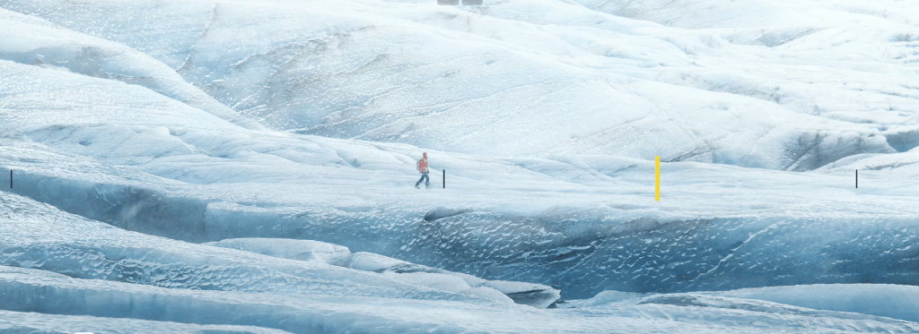
Image courtesy of Gretel

Image courtesy of Gretel
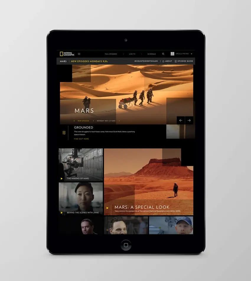
Image courtesy of Gretel
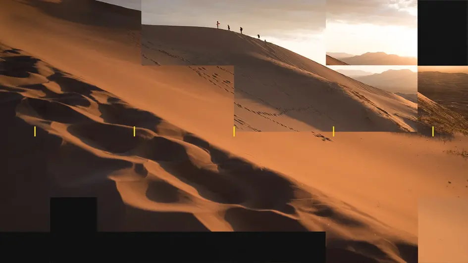
Image courtesy of Gretel

Image courtesy of Gretel
A Unified Brand Powered by Intelligent Personalization
National Geographic’s strength has always been its content — and its ability to connect with audiences on a personal level. They’re the most engaged non‑profit brand on social media, and that’s not by accident. Their digital ecosystem is built on personalization and data‑driven storytelling.
A major part of this evolution was CHIP (Cohesive Intelligent Platform), developed in partnership with Microsoft. CHIP analyzes user behavior across the entire National Geographic network, allowing the brand to deliver content tailored to individual interests.
Here’s how it works:
- Behavioral Analysis: The platform studies how users interact with articles, videos, and topics.
- Personalization: Based on these patterns, it recommends content aligned with each user’s curiosity.
- Content Unification: It breaks down internal silos, shifting the brand from static publishing to dynamic audience engagement.
Since then, National Geographic has expanded its tech stack further, partnering with Amazon Web Services for machine‑learning‑assisted storytelling and building educational portals through National Geographic Learning.
A Masterclass in Modern Brand Evolution
National Geographic’s transformation is a powerful example of how legacy brands can evolve without losing their soul. They honored their heritage, elevated their visual identity, unified their brand architecture, and embraced intelligent technology — all while staying rooted in their mission to explore and illuminate the world.
It’s a reminder that the strongest brands don’t just update their visuals. They evolve their systems, their storytelling, and their relationship with their audience. They move further — and bring the world with them.
If you’re ready to build or scale you brand and carve a stronger position in the marketplace Contact Us
