Instagram’s 2026 Rebrand: Why the Backlash Happens Every Time (And Why It Actually Makes Sense)

Many years ago, Instagram rolled out a rebrand that was met with pure online vitriol — from the general public, celebrities, and pretty much anyone with a phone. At this point, we should all know the pattern: when a major brand changes anything, backlash is guaranteed.
And here we are again. Big 2026. New Instagram wordmark. New brand system. New outrage.
The moment the new logo dropped, most people didn’t stop to ask the one question that actually matters: “Why?” Instead, they reacted on impulse — judging what they saw rather than trying to understand the deeper reasoning behind the redesign.
Fortunately for you, I’m not “most people.” So let’s break it down.
A Wordmark Redesign, Not an Icon Redesign
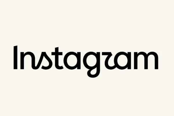
Instagram didn’t touch the iconic camera‑gradient symbol. The update is entirely in the wordmark — a hybrid of a clean geometric sans serif with subtle script features.
The intention behind this mashup is clear: bold + modern + timeless paired with warmth + individuality + handmade character
It’s a smart evolution. The original wordmark felt human, crafted, and deeply connected to the idea of people connecting with people — which is why it worked so well for a social platform. Script lettering is inherently human. It’s drawn, not generated.
But when you place the new wordmark beside the icon, you see the logic. The proportions, the stroke widths, the rhythm — they’re all in conversation with the symbol. And if you look at the sketches from the ideation phase, you can literally see how the icon inspired the new typography.
Probst, the lead designer, summed it up perfectly: The new logo is “simpler and bolder” while still having “a handmade feel.” The goal was to create something familiar, but sharper and more modern — something that meets the community where it is now.

Old instagram wordmark next to new one
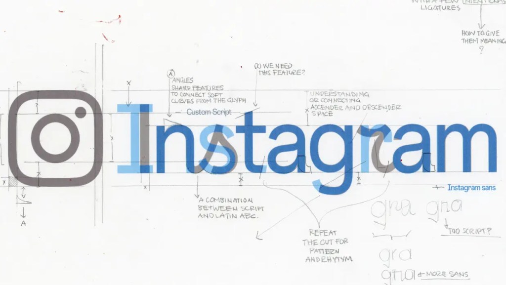
Instagram: Copyright © Meta, 2026
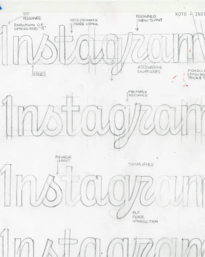
Instagram: Copyright © Meta, 2026
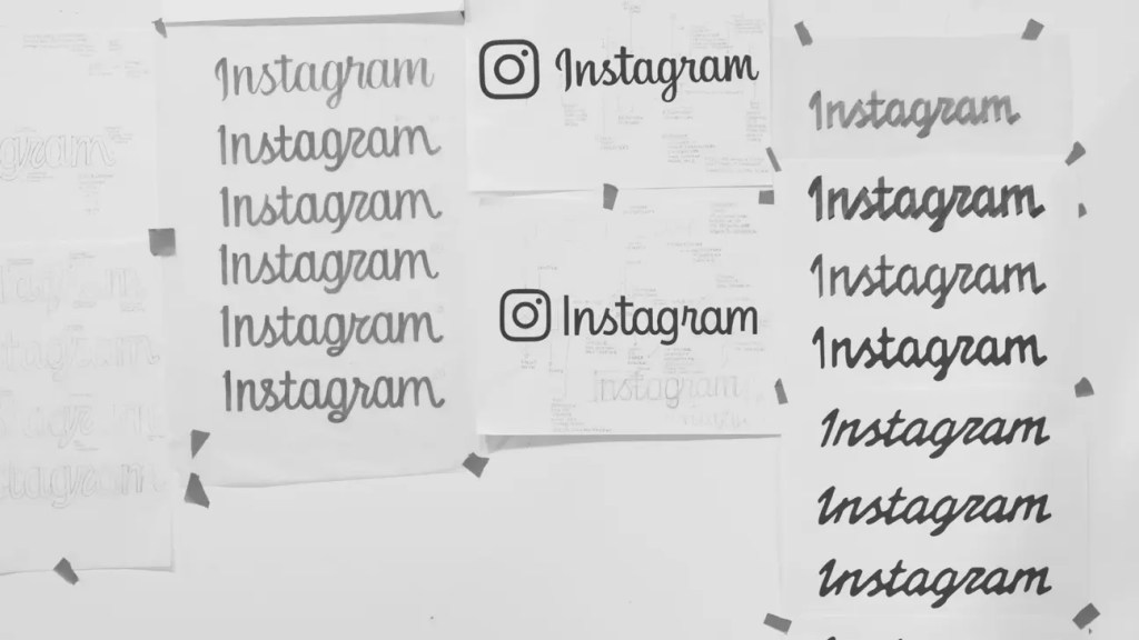
Instagram: Copyright © Meta, 2026
About That Controversial “r”
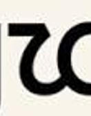
Let’s talk about the drama.
People claim the “r” looks like a “z.” Some say it’s illegible. Some say it’s a design crime.
I think that’s silly.
Script lowercase r’s often read as something else — sometimes an “n,” sometimes a shape entirely unrelated to the alphabet. Script is not mainstream reading style. It’s interpretive by nature.
And let’s be honest: everyone knows what the wordmark says. It’s Instagram. A global brand with massive equity. They can afford slight illegibility for the sake of distinctiveness.
Kia did the same thing. Their new logo confused people — some saw “KN,” some saw “KIN.” But Kia is Kia. The equity carries the recognition. The same principle applies here.
Large brands can take risks because their names are already cemented in culture.
A Brand System Built to Last (But Still Evolve)
The logo is designed to last decades — or at least as close to “forever” as a brand can get. But the broader identity system? That’s meant to evolve.
This refresh brings clarity and restraint to Instagram’s visual language. The UI and brand elements step back, allowing creators’ content to step forward. Instagram becomes less of a frame and more of a stage.
The gradient remains, but it’s no longer the star of the show. It’s now a subtle horizontal bar, occupying less than 20% of the system. A nod to history, but not a crutch.
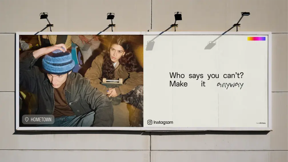
Instagram: Copyright © Meta, 2026
Did Meta Influence the Typography?
A fair question.
Probst explained that across Meta, wordmarks aim to feel like individual apps while still belonging to a larger brand family. Instagram’s refresh was focused on Instagram’s community — but it still fits comfortably within Meta’s broader ethos.
This is how strong brand architecture works: distinct identities, shared DNA.
Backlash Is Part of the Cycle — And It’s Actually Healthy
I’ve written about this before in Why Changing Your Logo Triggers Backlash (And Why That’s a Good Thing), Discord’s Rebrand: From Gaming Hub to Global Communication Platform and When Walmart changed its logo
Every major rebrand triggers outrage. Every time. Every industry. Every audience.
Design teams expect it. They prepare for it. But it still sucks to have years of work dismissed in the first 24 hours before the storm settles and people adjust to the new normal.
But backlash means people care. Silence is the real danger.
My Take as a Brand Designer
Overall, the new identity is beautiful, intentional, and surprisingly elegant. After sitting with it for a day or two, it’s grown on me. I’ll miss the old wordmark — it had a human warmth that’s hard to replicate — but I respect the evolution.
And as Probst said, not taking risks is a disservice to the community.
Instagram took a risk. A calculated one. A strategic one. A necessary one.
And that’s exactly what great brands do. Contact Us