Barbados logo redesign- Passion Project

The Challenge
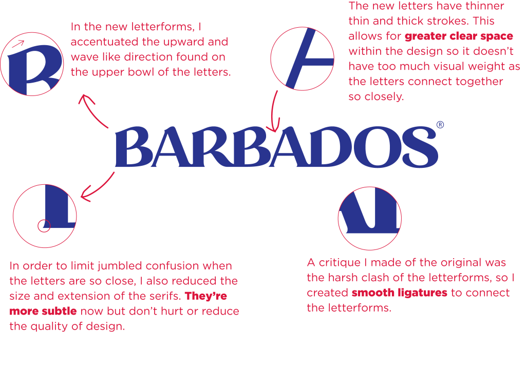
The original BARBADOS wordmark carried recognition and cultural weight, but it struggled with consistency and legibility. At small sizes, spacing collapsed, letterforms blurred, and the mark failed to perform across modern applications. For a nation‑level identity, that’s a critical flaw. The letterforms are from a font pulled from the internet and just mashed together. No harmonious merging. The letterforms are already heavy, and the awkward clash makes it even heavier. Not to mention the weird, awkward gaps left between the bottom of the ‘B’ and ‘A’ in the harsh clashing of the two letters.

Old Barbados logo

My redesign
The Passion Behind the Project
This wasn’t a client commission; it was a passion project. As a Barbadian designer working globally, I wanted to honor the identity of my home while demonstrating the craft and discipline that UK and international clients expect. The redesign was driven by respect: respect for heritage, respect for typography, and respect for the people who interact with the wordmark every day.
The Approach
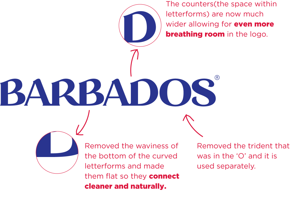
Rather than reinventing, the goal was refinement. I rebuilt each letter from scratch, preserving the rhythm and closeness that gave the original its spirit. Adjustments were made to weight, spacing, and proportions to ensure the wordmark could scale — from digital screens to physical merchandise — without losing impact.



The Solution
- Structural corrections: slimmer letterforms and balanced proportions.
- Functional refinements: improved legibility and greater scalability.
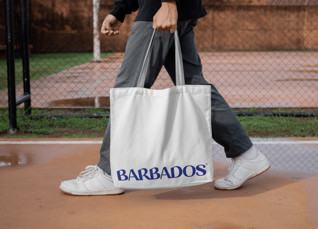
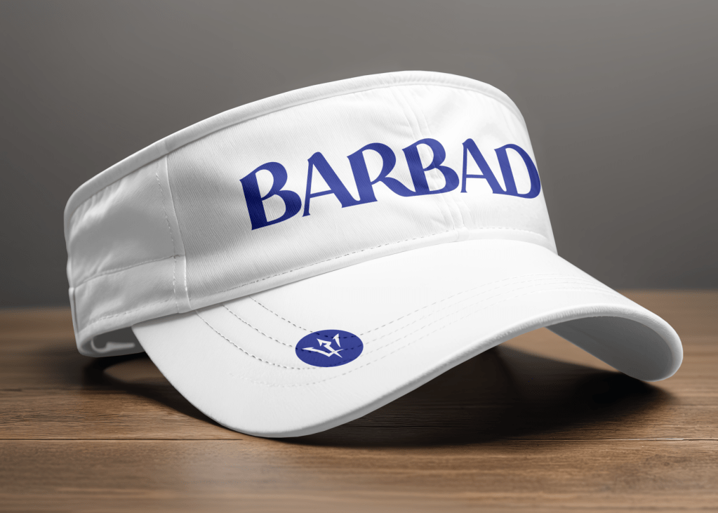
- Applications tested: tote bags, caps, folders, and apparel to confirm versatility.
The result: a wordmark that feels familiar yet elevated — honoring the original while meeting modern branding standards.
The Impact
For Barbadian businesses, this redesign shows how heritage can be preserved while making a mark fit for global competition. For UK clients, it demonstrates the value of precision typography and strategic refinement in building brands that scale internationally. And for me, it was proof that passion projects can spark conversations and showcase the depth of design thinking behind every successful identity.