
PayPal’s Rebrand: Lessons for Finance & Fintech Logo Design

Rebranding a decades‑old financial giant like PayPal is not just a design exercise—it’s a masterclass in balancing heritage with innovation. For fintech and finance founders, this case study offers invaluable lessons on how to approach brand identity when the stakes are high, whether you’re launching a new startup or revitalizing an established institution.
The Challenge of Rebranding Legacy Finance Brands
Creating a new brand identity is liberating. With a clean slate, designers and strategists can craft a narrative from scratch, choosing symbols, colors, and typography without constraints. But when working with a brand that already has deep equity—like PayPal—the responsibility is far greater. Every decision must respect what consumers already recognize while still pushing the brand forward into relevance.
For finance and fintech companies, this balance is critical. Trust is the currency of the industry. A logo or identity that feels too radical risks alienating long‑standing users. Too conservative, and the brand may appear outdated in a fast‑moving digital economy. PayPal’s rebrand demonstrates how to walk this tightrope.
The Evolution of the “PP” Logo Mark
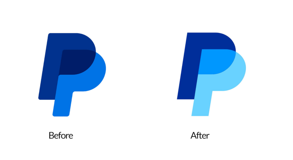
Since 2014, PayPal’s “PP” logo mark has been one of the most recognizable symbols in fintech. In the recent rebrand led by Pentagram partner Andrea Trabucco‑Campos, the mark was refined rather than reinvented. The palette of blues became more vibrant, with greater contrast. The lighter “P” now takes the foreground, reversing the illusion of depth from the previous design. Rounded corners were replaced with flat edges, giving the mark a sharper, more modern look.
This subtle evolution shows fintech founders that logo design doesn’t always require dramatic change. Sometimes, incremental refinements—adjusting contrast, sharpening edges, modernizing palettes—can signal progress while preserving recognition.
The Wordmark Takes Center Stage
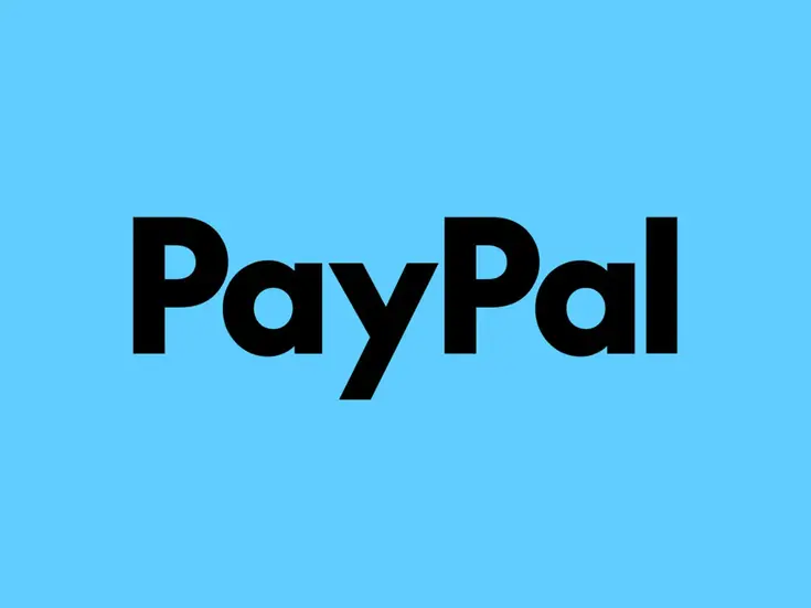
The most significant shift in PayPal’s identity is the prominence of its wordmark. Based on a customized version of LL Supreme (a contemporary redrawing of Futura), the wordmark is upright, black, and stripped of its former blues. Corners are flattened, italicization removed, and clarity prioritized.
Typography now drives PayPal’s brand communication. Bold type, generous white space, and clean layouts dominate advertising and collateral. This emphasis on type reflects a broader trend in finance branding: clarity and legibility are paramount. In industries where trust and transparency are essential, typography becomes more than aesthetic—it becomes a signal of reliability.
For fintech founders, this lesson is clear: invest in typography. A bespoke typeface or carefully chosen font can elevate your brand, making it feel timeless and authoritative.
Photography and Motion: Humanizing Digital Finance
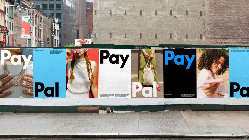
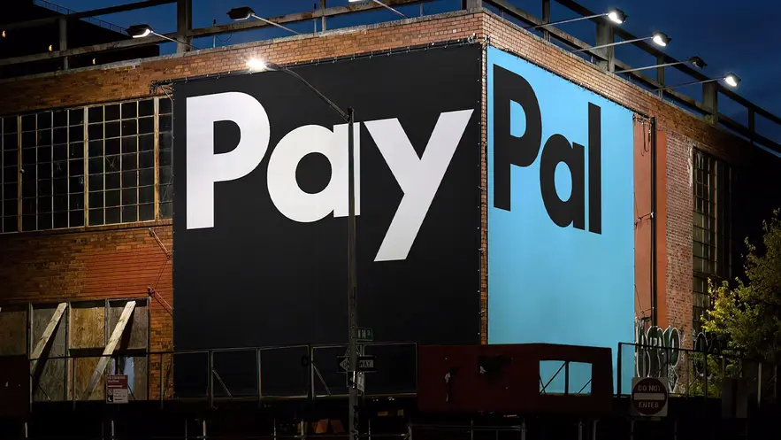

Beyond logo and type, PayPal’s rebrand integrates lifestyle photography and a new motion system. The photography emphasizes inclusivity—PayPal is for “everyone, everywhere.” It showcases real people grounding the digital brand in human experience.
The motion system mimics the seamless actions of tapping, swiping, and clicking. This is not just aesthetic; it reflects the product experience. Branding becomes an extension of user interaction, reinforcing the promise of simplicity and ease.
For fintech startups, this is a powerful takeaway: branding should mirror the product experience. If your service is seamless, your brand identity should feel seamless. If your product emphasizes security, your visuals should feel solid and trustworthy.
Color Palette: Vibrant Simplicity
The rebrand’s palette of vibrant blues contrasted with black and white embodies the principle of “Keep it simple, stupid.” In a cluttered digital world, PayPal chose clarity over complexity. The result is bold, simple, and instantly recognizable.
Finance and fintech founders should note: color is not decoration. It’s a strategic tool. Vibrant blues signal trust, innovation, and digital fluency. Black and white provide contrast and timelessness. Together, they create a palette that is both modern and enduring.
Lessons for Fintech and Finance Founders
- Respect Equity, But Innovate If your brand already has recognition, don’t discard it. Build on it. Subtle refinements can modernize without alienating.
- Typography as Strategy Fonts are not neutral. They communicate clarity, authority, and trust. Invest in type that reflects your brand’s values.
- Mirror the Product Experience Motion, photography, and layout should reflect how users interact with your service. Branding is an extension of UX.
- Color as Signal Choose palettes that align with industry expectations but differentiate you from competitors. Finance often leans on blues for trust—find your unique shade and pairing.
- Simplicity Wins In a noisy market, clarity stands out. Bold, simple, recognizable branding builds trust faster than complexity.
Why This Matters for Finance & Fintech Branding
The PayPal case is not just about one company. It’s a blueprint for how finance and fintech brands can evolve. Whether you’re a startup seeking to establish authority or an established firm looking to modernize, the principles are the same: balance heritage with innovation, clarity with distinctiveness.
In saturated markets like NYC and London, where fintech startups compete for investor attention, branding is not optional. It’s a strategic asset. A logo is not just a mark—it’s a trust signal. A wordmark is not just type—it’s a promise of clarity. Photography is not just imagery—it’s proof of inclusivity. Motion is not just animation—it’s a reflection of seamless service.
Building Your Own Finance Brand Identity
As a brand designer specializing in finance and fintech, I help founders navigate these challenges. Whether you’re launching a new venture or refining an existing identity, the goal is the same: create a brand that is bold, simple, and recognizable. A brand that attracts investors, builds trust with clients, and endures in competitive markets.
If you’re seeking a finance or fintech logo designer in NYC, the UK, or globally, let’s talk. Strategic branding is not about decoration—it’s about building authority, trust, and growth. Contact me today to craft a brand identity that stands out and lasts. Contact Us
