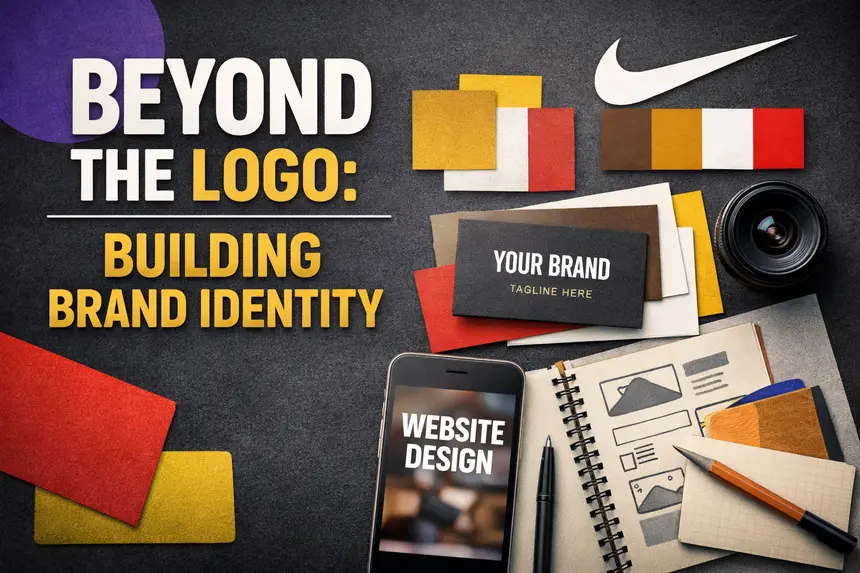
The Logo Isn’t the End‑All Be‑All in Branding

I started working with a client the other day. I can’t share too much due to an NDA, but I can talk about the experience. From our very first conversations, they kept emphasizing the importance of the logo.
Now, don’t get me wrong: a logo is very important. It’s one of the most critical elements of any brand. A logo is the identifying mark of your business. Done right, it aids in brand recall and recognition. But here’s the nuance: while the logo is vital, it’s not the only thing that matters when building a brand.
Why Logos Get So Much Attention
Clients often place the logo on a pedestal. It’s the most visible piece of the identity, the part that gets stamped on packaging, websites, and business cards. It’s what investors and buyers look at when evaluating brand equity. My client even noted that logos are what businesses invest in when acquiring other companies, because they hold equity.
There’s truth in that. Logos do carry weight. But when thinking about a brand, you have to think holistically. Recognition and equity aren’t built on the logo alone.
The Power of Color
Take color, for example. A color scheme can instantly trigger brand recall. Think of UPS with its brown and gold. KFC with its red and white. If you’re from Barbados, purple and yellow immediately bring Chefette to mind.
I once saw an Instagram post that asked people to identify brands using only color palettes — no logos. Each slide displayed a set of colors, and people nailed the answers. That’s how powerful color is in branding.
Typography, Layout, and Style
Typography is another overlooked asset. The way a brand chooses and uses type can become just as recognizable as a logo. A consistent type system across ads, packaging, and digital platforms builds familiarity.
Layout, photography style, illustration style, and messaging all contribute to how a brand is perceived. These elements don’t just support the logo — they amplify it.
When you see Apple’s clean product photography or Spotify’s bold, vibrant layouts, you know the brand instantly. That recognition doesn’t come from the logo alone.
Equity Is About Reputation
Brand equity isn’t stored in the logo. A logo is a vessel, a symbol that reflects how people feel about the brand. If the brand has a bad reputation, the logo inherits that negativity. Think of the swastika: once a symbol of peace, now forever defined by what it represented in the 20th century.
Equity is built on reputation, consistency, and lived experiences. It’s about what the brand does, how it communicates, how long it’s been around, and how people feel about it. The logo merely represents those feelings visually.
Iconic Logos Aren’t the Whole Story
My client mentioned iconic marks like Nike’s swoosh as proof of why logos matter most. And yes, the swoosh is iconic. But Nike didn’t build equity on the swoosh alone. They built it through decades of storytelling, athlete endorsements, product innovation, and cultural relevance. The swoosh became powerful because of what Nike did, not because of its shape.
That’s why I remind clients: your brand is not Nike. Don’t compare yourself to giants. When others zig, you zag. Be different. Build equity through your own story, your own values, your own consistency.
The Role of the Logo in Identity Design
Despite everything I’ve said, I take logos seriously. I was a logo designer before I built full brand identities, and I still believe the logo is vital. It’s not a half‑measure. It requires thought, craft, and precision. The logo sets the tone for the rest of the identity system.
But it’s not the end‑all be‑all. It’s one piece of a larger puzzle. A strong brand identity integrates the logo with color, type, imagery, and messaging to create a cohesive system. That system is what builds recognition, trust, and equity over time.
Why Holistic Branding Matters
Founders often underestimate how much brand identity impacts growth. A logo alone won’t carry you into new markets. When you expand internationally, consistency across touchpoints matters. Your color palette, typography, and messaging need to translate across cultures.
Think about Airbnb or Spotify. Their logos are recognizable, but their equity comes from consistent experiences. The app interface, the tone of voice, the photography style — all of it reinforces the brand. That’s what makes them memorable.
Caribbean Context
Living and working in Barbados, I see how local brands build recognition differently. Chefette isn’t just purple and yellow. It’s the smell of fried chicken, the layout of the restaurant, the tone of their ads. The logo is part of it, but the experience is the brand.
For Caribbean businesses expanding into the U.S. or U.K., this holistic approach is even more critical. International audiences may not know the logo yet, but they’ll connect with consistent messaging, design systems, and experiences. That’s how you build equity across borders.
The Danger of Over‑Investing in Logos
When founders pour all their energy into the logo, they risk neglecting the rest of the identity. They end up with a beautiful mark but inconsistent collateral. The website feels disconnected from the social media. The packaging doesn’t match the tone of the ads.
That inconsistency erodes trust. Audiences may recognize the logo, but they won’t feel confident in the brand. Equity isn’t built on recognition alone — it’s built on trust.
What Founders Should Focus On
So what should founders prioritize?
- Consistency across touchpoints. Every interaction should feel like the same brand.
- Clarity in messaging. Your tone of voice matters as much as your visuals.
- Emotional resonance. People remember how you made them feel, not just what your logo looked like.
- Adaptability. Your identity system should scale across platforms and markets.
The logo is part of this, but it’s not the whole story.
A logo is important. It’s the face of your brand. But it’s not the brand itself. Equity is built through reputation, consistency, and holistic identity design. When you invest in branding, don’t stop at the logo. Build the system. Build the experience. Build the trust.
That’s how you create a brand that lasts. Contact Us
FAQ’s
Is a logo enough to build brand equity? No. A logo is important, but equity comes from reputation, consistency, and the overall brand experience.
Why do clients focus so much on logos? Because logos are visible and tangible, often seen as the “face” of the brand. But they’re only one part of a larger identity system.
What other elements build brand recognition? Color palettes, typography, photography style, illustration style, and messaging all contribute to recognition and recall.
Can a bad reputation ruin a good logo? Yes. A logo reflects how people feel about the brand. If the brand has a poor reputation, the logo inherits that negativity.
Should startups compare their logos to Nike or Apple? No. Iconic logos became powerful through decades of storytelling and consistency. New brands should focus on building their own unique identity.
What’s the role of the logo in identity design? It sets the tone and acts as a key identifier, but it must work within a holistic system of visuals and messaging.