
Why Are So Many Luxury Brand Logos… Bad?
Luxury branding is supposed to feel luxurious — high‑end, sophisticated, intentional. So why do so many luxury brand logos look bland, generic, or downright ugly?
It’s a question a lot of founders ask, especially when they expect luxury branding to communicate heritage, craftsmanship, and exclusivity. Yet over the last decade, we watched luxury brands strip away the very elements that made them iconic, replacing them with minimalist sans‑serif wordmarks that could belong to any brand in any industry.
And here’s the truth:
Minimalism isn’t the problem. The loss of identity is.
The Great Luxury Logo Flattening
There was a period where luxury brands collectively decided that heritage didn’t matter. Out went the ornate monograms, the illustrated crests, the historical symbols. In came the “safe” sans‑serif wordmark — the same formula used by tech startups, DTC brands, and every minimalist rebrand of the 2010s.
Now, I’m the first person to advocate for simplicity.
If you’ve followed my philosophy on logo design, you know I believe in clarity, scalability, and restraint.
But here’s the issue: When every luxury brand simplifies the same way, it stops being luxury — it becomes generic.
Luxury is built on distinction.
Branding is built on differentiation.
When everyone looks the same, no one feels premium.
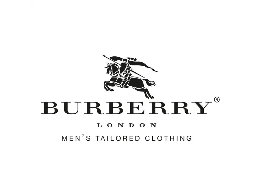
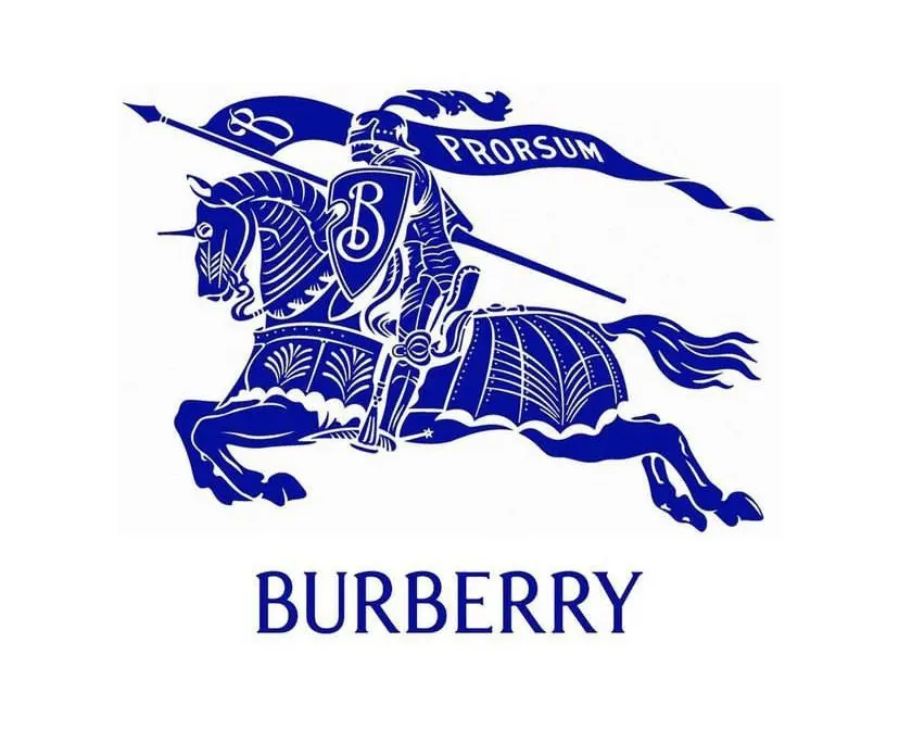
Burberry: A Case Study in Lost Heritage
When Burberry removed the equestrian knight, they didn’t just simplify — they erased a core part of their brand story. Yes, the original illustration had scaling issues. Yes, it needed refinement. But the solution wasn’t to abandon it entirely.

A better approach?
Simplify the illustration. Modernize the linework. Preserve the heritage.
And clearly, the brand realized this — because in 2023, Burberry brought the knight back, pairing it with a refreshed, more contemporary wordmark. A perfect example of how luxury brands can evolve without losing their soul.
Yves Saint Laurent: A Missed Opportunity
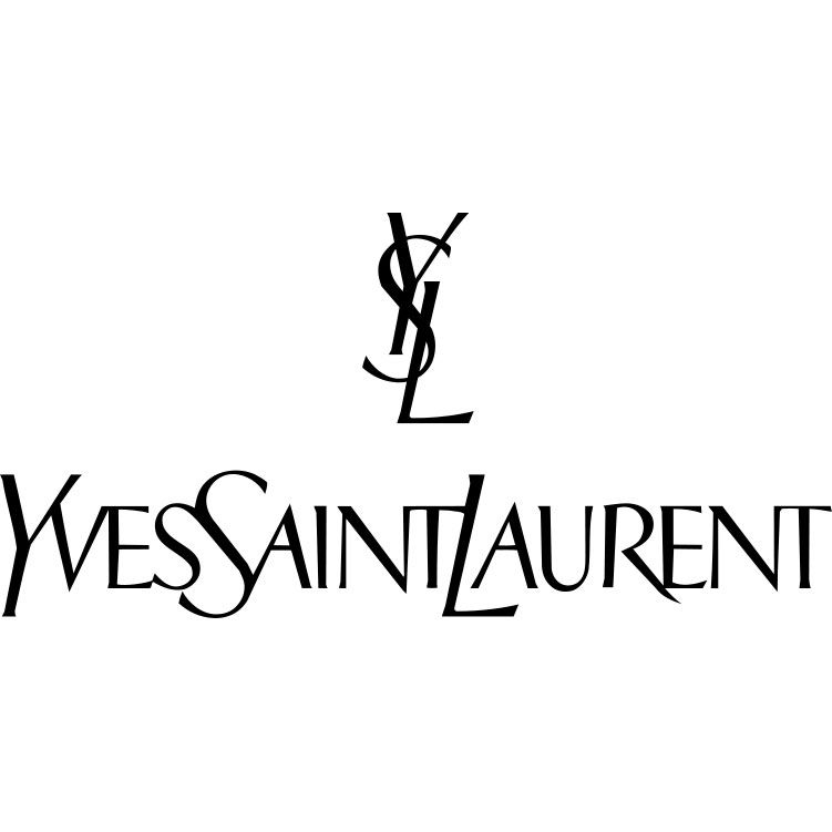
Let’s be honest: the old YSL logo wasn’t perfect. The monogram was cluttered, the spacing was tight, and the typography was…actually interesting if I’m being honest.
But it wasn’t beyond saving.
Instead of refining the monogram, adjusting the spacing, or modernizing the wordmark, the brand opted for the same minimalist sans‑serif approach everyone else was doing. And while it’s clean, it lacks the personality and elegance the original identity hinted at.
A thoughtful redesign could have:
- Increased white space
- Clarified the monogram
- Refined the letterforms
- Preserved the brand’s iconic silhouette
Luxury branding should evolve — not erase.
Versace: The Medusa Problem

Some logos need refinement.
Versace’s Medusa needs a full intervention.
The concept is brilliant. The mythology is rich. The symbolism is perfect for a luxury house.
But the execution?
Over‑illustrated, over‑detailed, and visually chaotic.
When cast in metal or printed on products, the Medusa often looks like a blob of tangled shapes — more like melted gold than luxury craftsmanship.
The idea doesn’t need to change.
The design does.
A simplified, more sculptural Medusa could elevate the brand dramatically while keeping its iconic identity intact.
So Why Do Luxury Logos Look Bad?
Because many luxury brands confuse “minimal” with “modern,” and “modern” with “meaningless.”
Luxury branding should feel:
- Distinct
- Intentional
- Crafted
- Rooted in heritage
- Designed with restraint, not stripped of identity
Minimalism works when it’s strategic.
It fails when it becomes a trend.
If You Want a Luxury Logo That Doesn’t Suck…
If you’re building a luxury brand — whether in fashion, real estate, finance, hospitality, or lifestyle — your logo needs more than a trendy typeface.
It needs:
- Heritage
- Craftsmanship
- Clarity
- Scalability
- Distinctiveness
- A story worth paying a premium for
That’s what I design.
If you want a luxury brand identity that actually feels luxurious, you know where to find me. Contact Us