
Why Barbados Needs Stronger Logo Design: A Designer’s Perspective

Barbados is celebrated worldwide as a premier Caribbean tourist destination. Tourism is not just part of our culture—it’s the backbone of our economy. And when an industry carries that much weight, its branding matters. The Barbados Tourism Marketing Inc. (BTMI) logo has become the forward‑facing symbol of our island, appearing on merchandise, signage, and across digital platforms. For many visitors, it’s the first visual impression of Barbados.
But here’s the truth: while the logo has potential, it falls short of what Barbados deserves. As a professional logo and brand designer based in Barbados, I want to break down why.
The Problem With Letterspacing
The BTMI logo uses extremely tight tracking—the spacing between letters—so much so that the letterforms touch. Done well, this technique can create unity. Done poorly, it creates clutter. In this case, the letters simply collide without thoughtful ligatures or design adjustments. The result? A jumbled wordmark that loses clarity.
When Logos Are Reversed: Why the BTMI Wordmark Breaks Down
One of the most overlooked aspects of logo design is how it performs when colors are inverted. In the case of the BTMI logo, the flaws in its letterspacing become even more pronounced when the logo is reversed—white letters on a colored background.
Here’s why: when a logo is reversed, our eyes perceive strokes as thicker and counter spaces (the openings inside letters) as smaller. This optical illusion is normal, which is why good designers adjust for this. When letters are already clashing into each other due to poor tracking, the effect is magnified. Instead of a clean, unified wordmark, the reversed logo looks heavy, cramped, and jumbled.
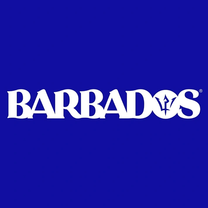
This is more than a technical detail—it’s a practical test of resilience. A strong logo should remain legible and balanced whether it’s printed in black and white, reversed on signage, or scaled down for merchandise. The BTMI logo fails this test, which undermines its role as the visual ambassador of Barbados.
There is also very small and awkward spaces left by the serifs of the letter forms when they come into contact with the letter next to it, due to this very tight unadjusted letterspacing.

Missed Opportunity With Ligatures
Ligatures are subtle design connections between letters that make typography flow seamlessly. They can be as simple as extending a serif or as complex as reshaping two letters to merge naturally. The BTMI logo ignores this principle, leaving the word “Barbados” looking forced rather than fluid.
A Nod to the Island—But Not Enough
To its credit, the typeface chosen has a subtle wave‑like quality, a nice nod to our beaches. But without proper execution, that gesture gets lost in the noise of poor spacing.
The Trident in the “O”
Finally, the trident inside the “O” of “Barbados” feels cliché. Symbols from the national flag can be powerful in branding, but only when integrated with originality and intention. Here, it feels like an afterthought rather than a strategic design choice. The trident has been altered for the sake of the logo and is actually quite nice. If anything, it could be separate from the wordmark.
Why This Matters for Barbados Branding
Logos are more than decoration—they’re assets. They shape perception, build trust, and influence how industries like tourism are valued globally. When Barbados relies on a logo that feels unfinished, it sends the wrong message about our island’s sophistication and creativity.
As a Barbados‑based logo and brand designer, I believe our nation deserves branding that reflects its heritage, luxury, and global appeal. Whether for tourism, finance, real estate, or startups, strong identity design is what transforms businesses into trusted brands.
Looking for a Logo Designer in Barbados?
If you’re a founder, entrepreneur, or organization ready to elevate your brand, don’t settle for “good enough.” Barbados has the talent to create logos that stand as timeless assets, not clichés. My studio specializes in strategic identity design that blends storytelling, symbolism, and market analysis—crafted for businesses in Barbados and beyond.
Ready to invest in a logo that truly represents your brand? Let’s talk. Contact Us
