
Why the Ferrari Logo Fails — And What Great Logo Design Actually Requires

The Ferrari logo kinda sucks, to be honest. And that’s wild, because Ferrari is one of the most iconic luxury car brands on the planet. The emblem is loaded with history: the black horse is a tribute to Francesco Baracca, the World War I fighter pilot who painted the prancing horse on his plane for good luck. After he died, his mother told Enzo Ferrari to use the horse on his cars. The canary yellow background represents Modena, Enzo’s hometown. The green, white, and red stripes at the top nod to the Italian flag. And the “SF” stands for Scuderia Ferrari, the racing team.
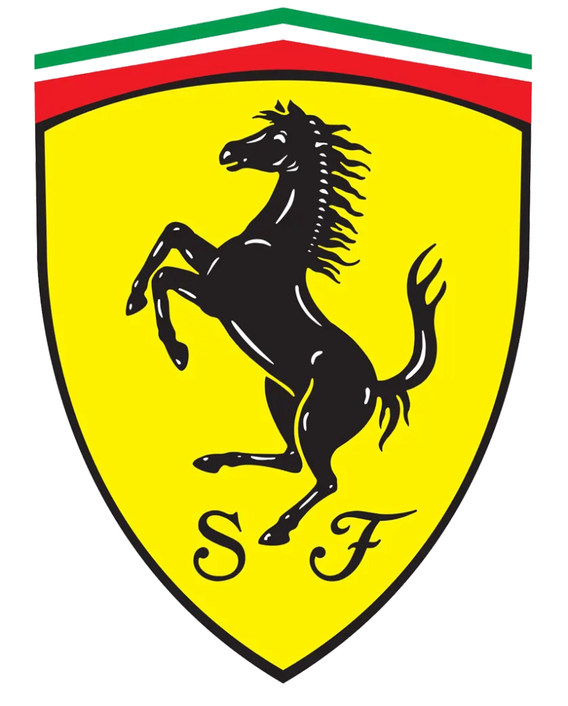
Ferrari’s logo
There’s a lot going on — but that’s not inherently the problem. Plenty of great logos carry multiple layers of meaning. The issue is that Ferrari’s logo is built around one central element, the horse, and unfortunately… the horse is the weakest part.
It looks like clip art. Not timeless. Not luxury. Not iconic. Just a generic horse silhouette you could find by typing “horse logo” into Google Images.

Ferrari’s logo on one of their cars
For a brand with beautifully engineered cars, global prestige, and a legacy that spans decades, the logo shouldn’t feel antiquated. Even the “SF” at the bottom looks like someone grabbed a script font they thought was fancy and called it a day. And when the horse is rendered in 3D metallic form, all the detail collapses into a muddy shape. Whatever clarity it had disappears.
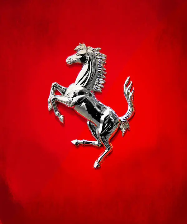
Ferrari’s logo in 3.d

Ferrari’s logo in 3.d
My suggestion? Simplify. Not because minimalism is trendy — but because clarity is essential. Modern luxury brands thrive on precision, separation, and intentional detail. Create distinction between the horse’s mane and head. Break up the shapes so the form reads cleanly at every scale and in every material. Keep the colors; they’re part of the heritage. But the typeface? Either integrate it properly or remove it entirely.
This is the difference between a logo that survives history and a logo that feels historical. Luxury brands evolve. Ferrari’s cars have evolved. The logo deserves the same treatment.
If you’re a founder in the US, UK, or Barbados building a brand with legacy-level ambition, this is exactly why your logo matters. It’s not decoration — it’s identity, clarity, and the first signal of the standard you hold. And if you want a brand identity that actually reflects the quality of what you’re building, that’s where I come in. Contact Us
