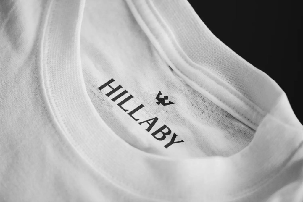
Hillaby — A Barbados‑Born Lifestyle Brand Rooted in Culture, Minimalism, and Identity

Hillaby is one of those rare projects where the brand story already lives in the soil. A lifestyle clothing brand born in Barbados and expanding into the US, Hillaby came to me with a clear intention: build a visual identity that feels unmistakably Barbadian while still carrying the elevation, restraint, and modernity needed to compete internationally.
From the beginning, the brand’s heartbeat was culture. Not the cliché postcard version of Barbados, but the lived textures — the sun that hits different, the sea that shapes everything, the fruits that define childhood, the quiet pride woven into the national identity. My job was to translate that into a visual language that felt both grounded and aspirational.
A Color Palette Pulled From the Island Itself
Hillaby’s palette is rooted in the natural environment. Every tone is intentional: the warmth of the sun, the depth of the ocean, the vibrancy of mango and dragon fruit. These aren’t just colors — they’re sensory anchors. They create a brand world that feels tropical without being loud, and premium without losing its authenticity.
Minimalism became the guiding principle. Clean lines, open space, and a calm visual rhythm allowed the palette to breathe and the cultural references to stand on their own. The identity needed to feel effortless, not over‑designed.


A Logo Built on National Symbolism and Brand Elevation
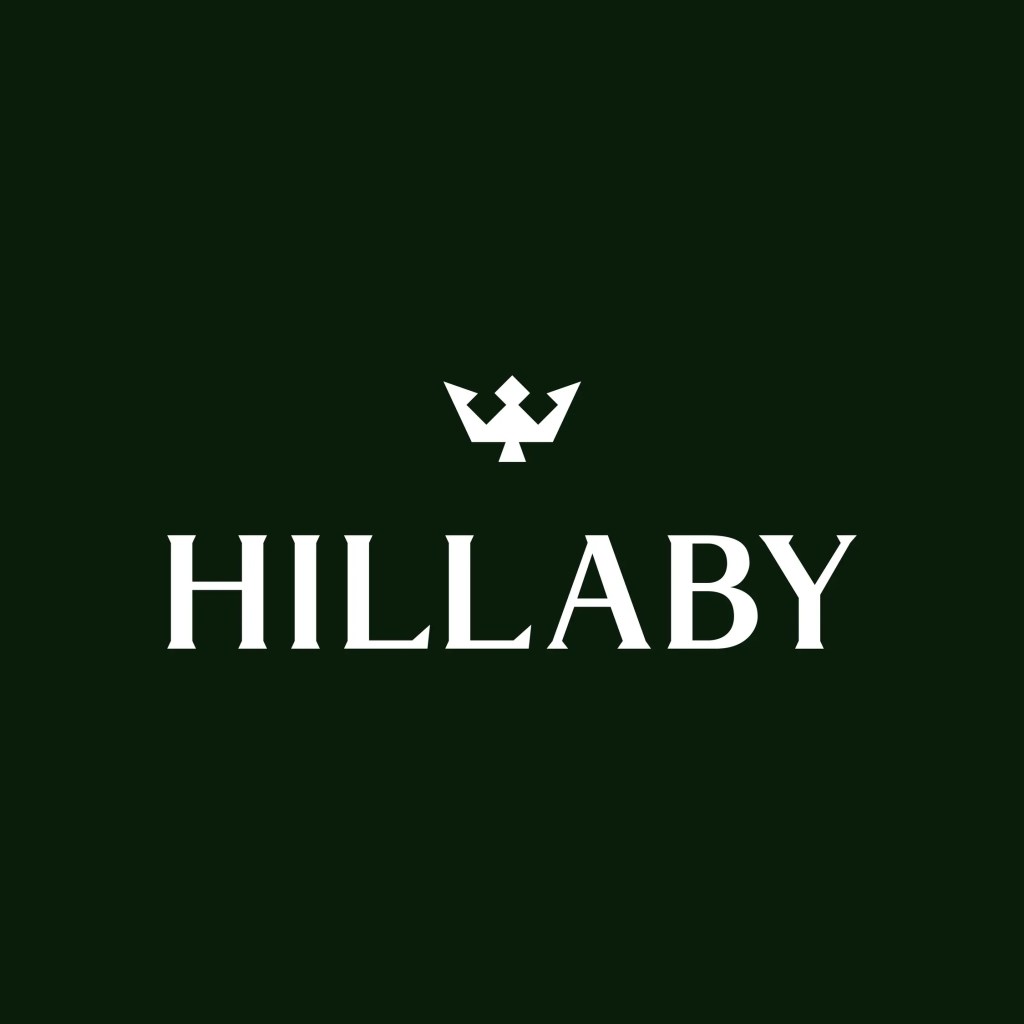
The centerpiece of Hillaby’s identity is its logo — a fusion of a trident and a crown.
The trident is the most iconic symbol of Barbados, sitting at the center of the national flag. The crown introduces a new layer: elevation, ambition, and the brand’s commitment to principled lifestyle design.
Together, they form a mark that feels regal without being pretentious, cultural without being literal. It’s a minimalist emblem that carries meaning at every point.
The wordmark features custom typography and is paired with the mark. The rest of the brand uses Optima and Helvetica. Optima for headings and large short form text, and Helvetica for reading text.
A Barbadian Brand Ready for Global Expansion
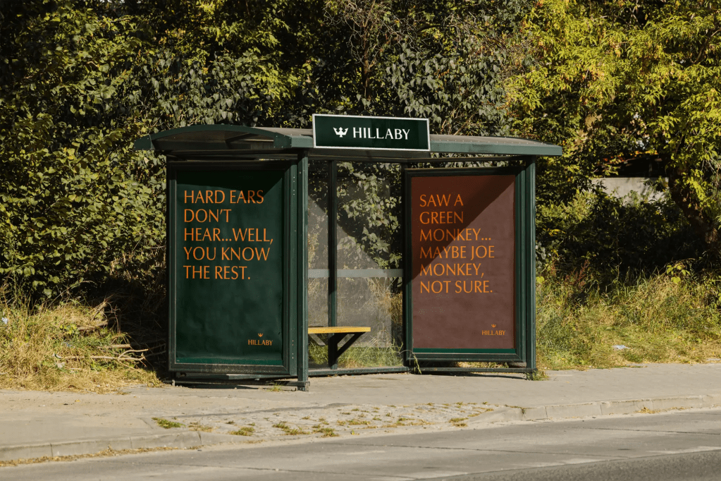
Hillaby’s identity was built to travel. While the brand is deeply rooted in Barbadian culture, the visual system is intentionally modern and adaptable — designed to resonate with US audiences who crave authenticity, story, and lifestyle brands with a point of view.
The result is a brand that feels like home to Barbadians and like discovery to everyone else.
Hillaby isn’t just a clothing brand. It’s a cultural export — and this identity gives it the clarity, confidence, and visual discipline to grow far beyond the island.